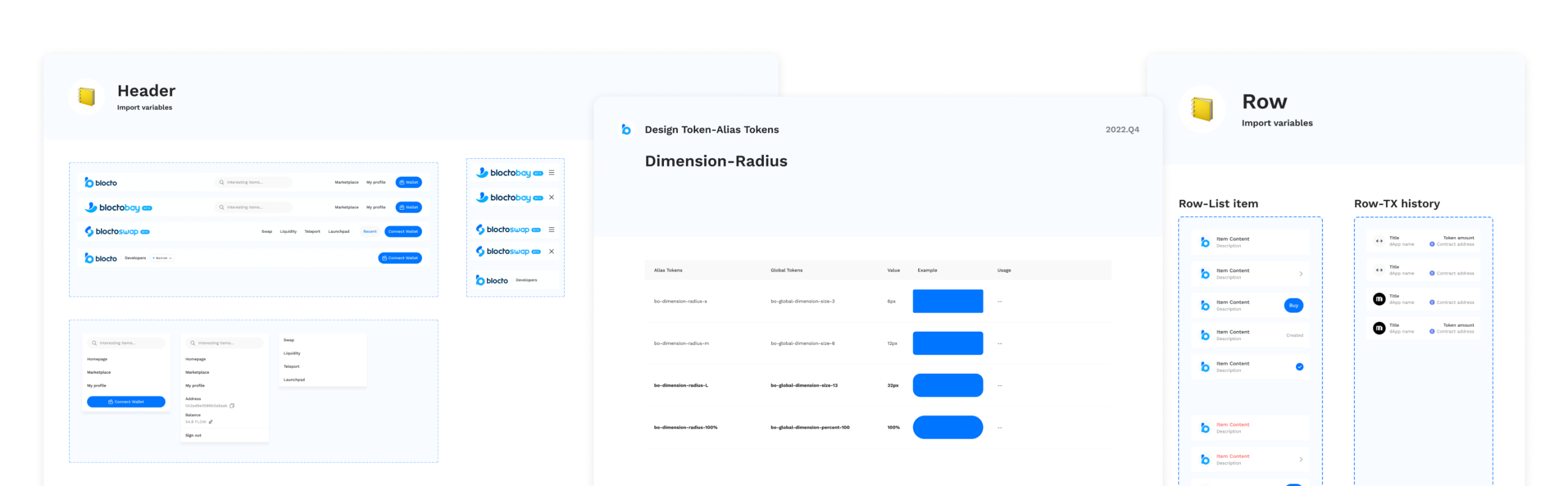
Component Library
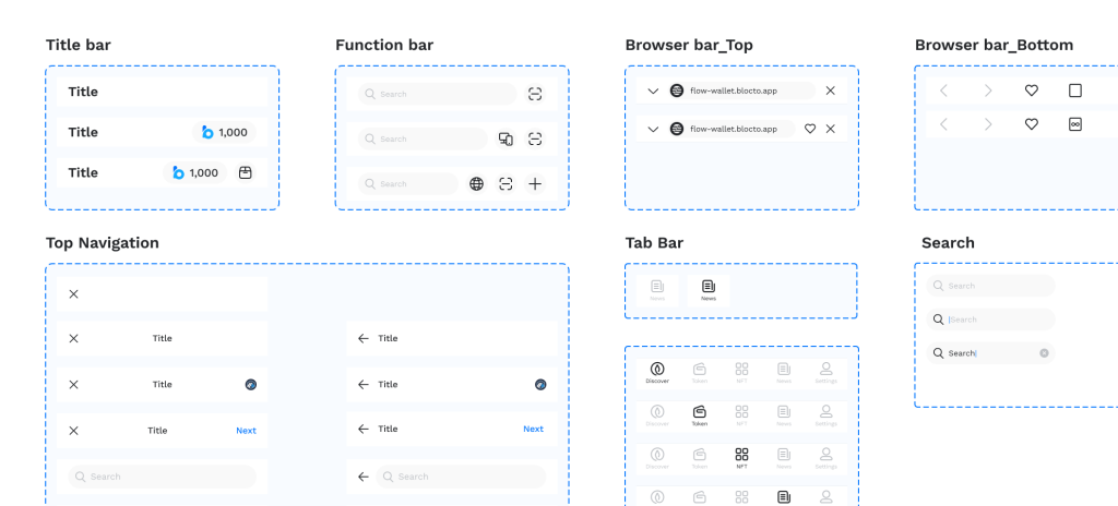
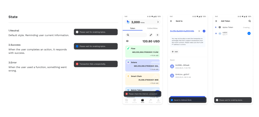
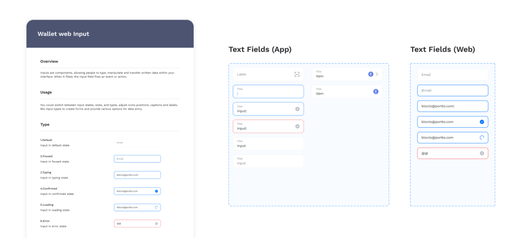
Built a scalable component library in Figma, including buttons, inputs, and cards with defined states (primary, secondary, disabled).
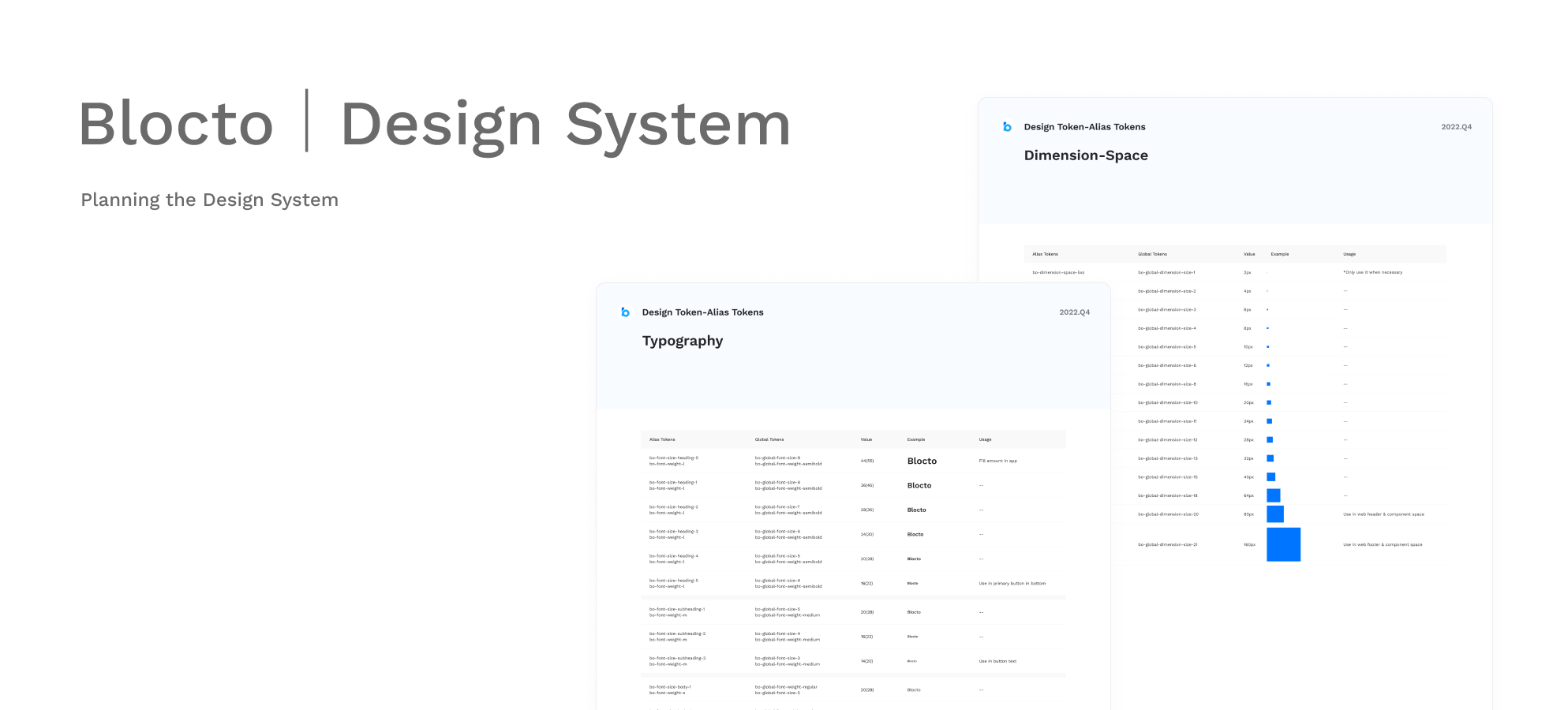
Established core colors, typography scales, and modular components (e.g., buttons with 5 sizes, 3 styles).
Design Guidelines
Documented rules for spacing, typography, colors, and interactions to ensure consistency across platforms.